How to Build an Investor-Ready Business Model Slide
Learn how to design a business model slide that survives fast investor reviews. What to include, layout options, templates, and worked examples for 2026.

A venture investor typically spends approximately two to four minutes reviewing a pitch deck, and only 58% of decks are viewed through to completion, according to RBCx's summary of pitch-deck analytics. Your business model slide may be the only financial picture an investor absorbs, so it can't behave like a pricing appendix. It has to show, almost immediately, who pays, what they pay for, and why the economics can improve with scale.
The strongest slides don't merely announce a revenue model. They expose the assumptions underneath it. A reader should be able to separate what you've validated from what you're testing, follow the path from customer acquisition to cash collection, and see what evidence would make you change direction.
Table of Contents
- Why Investors Give Your Business Model Slide Ten Seconds
- From Nine Canvas Blocks to One Slide
- Building the Core of Your Business Model Slide
- Choosing the Right Slide Layout for Your Model
- Showing What You Know and What You Are Still Testing
- Common Business Model Slide Mistakes and Quick Fixes
- Your Final Checklist Before the Deck Goes Out
Why Investors Give Your Business Model Slide Ten Seconds
The first mistake founders make is treating investor attention as a courtesy. It isn't. Investors review decks under time pressure, often deciding whether a company deserves deeper attention before they reach the financial projections. The same RBCx summary reports that only 58% of decks are viewed through to completion, which makes every early economic explanation more important than founders expect.
That constraint changes the job of the business model slide. It isn't a complete financial model, and it shouldn't repeat the income statement. It's an early economic checkpoint that answers three questions:
- Who pays? Name the customer with enough precision to distinguish the buyer from the end user.
- How does payment happen? State subscription, transaction fee, licensing, advertising, usage-based pricing, enterprise contract, or another mechanism.
- What makes growth financially plausible? Show the cost, margin, retention, acquisition, or operational dependency that determines whether revenue can scale.
If the slide takes a spoken explanation before the reader understands the basic mechanism, the design has already failed. Investors shouldn't need to infer whether “community,” “platform,” or “AI-powered marketplace” describes the product, the audience, or the monetization.
Practical rule: If a reader can't identify the payer and the revenue event before reading every bullet, simplify the slide.
Put the checkpoint in the story
A business model slide usually works after the problem, solution, market, and early traction have established context. At that point, the investor knows what you offer and why it might matter. The slide must then connect that value to a business that can collect money and control costs.
A useful review of investor presentation structure from Encelade can help founders assess the surrounding narrative, but the slide itself still needs to stand on its own. An investor who stops reading shortly afterward should already understand the basic economic architecture.
Don't cram every assumption onto the page. Put the central mechanism in the visual hierarchy, then support it with a small set of numbers or proof points. Pricing, gross margin, customer acquisition cost, average revenue per user, contract value, retention, and payback can all matter, but only when they clarify the engine rather than decorate it.
From Nine Canvas Blocks to One Slide
The modern business model slide descends from the Business Model Canvas, whose intellectual development began with Alexander Osterwalder's doctoral research at the University of Lausanne. The early business-model ontology developed around 2002–2004, followed by the academic review “Clarifying Business Models: Origins, Present, and Future of the Concept,” published with Yves Pigneur and Christopher L. Tucci in 2005. The framework was later refined into the familiar nine-block structure and formally clarified in Business Model Generation by 2010, as documented in this overview of the framework's development.
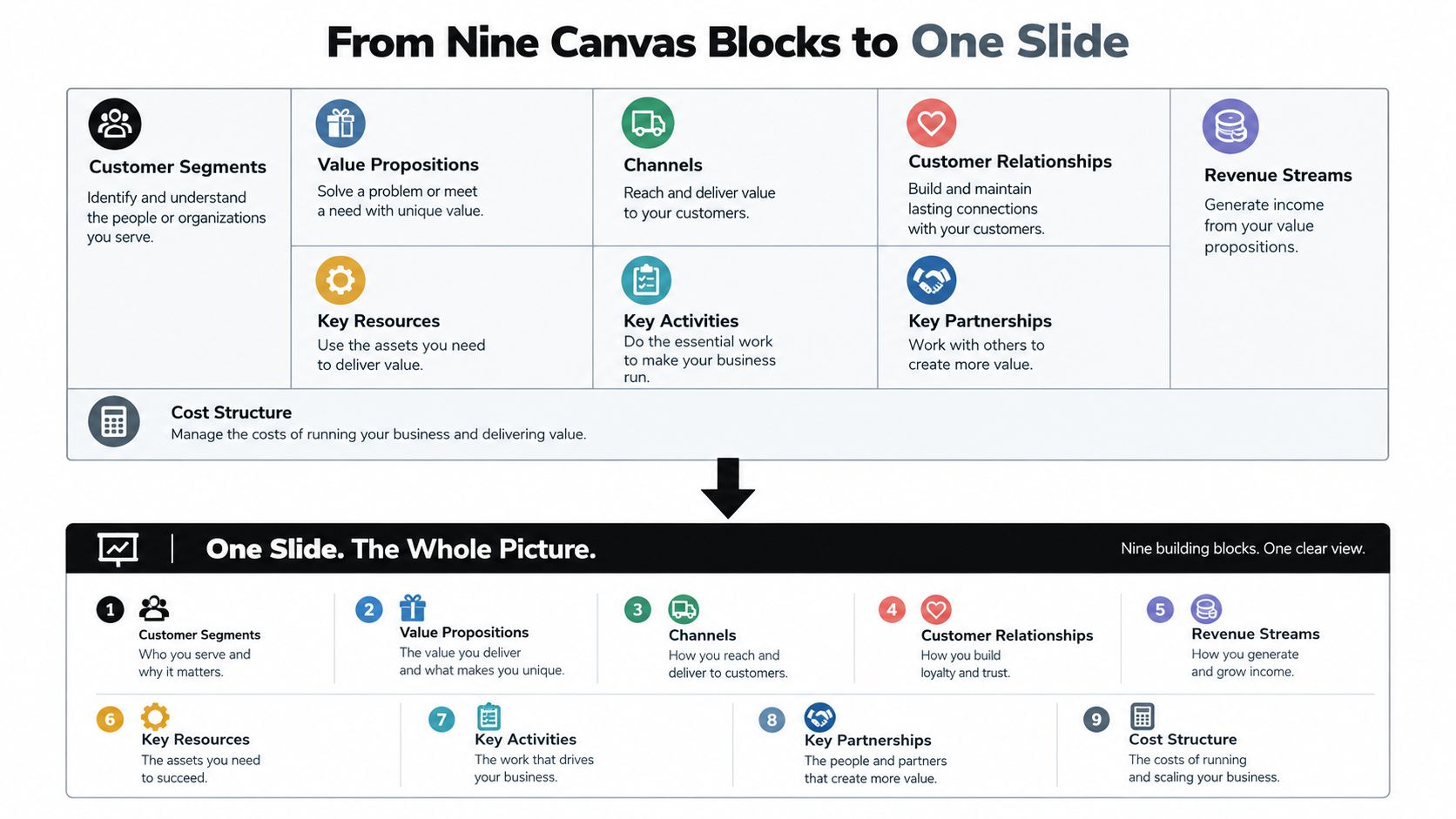
The Canvas contains customer segments, value propositions, channels, customer relationships, revenue streams, key resources, key activities, key partners, and cost structure. Together, these blocks explain how an organization creates, delivers, and captures value. A pitch deck can't reproduce the whole framework at full resolution, nor should it. The compression is the point.
What belongs on the investor slide
The slide should pull the most investment-relevant relationships from the Canvas:
- Customer segments and relationships become the paying customer, buyer trigger, and retention logic.
- Value proposition and channels become the reason customers buy and the path used to acquire them.
- Revenue streams become the pricing or transaction mechanism.
- Key resources, activities, and partners become the delivery dependencies that affect margin and scalability.
- Cost structure becomes the variable cost, acquisition cost, service burden, or working-capital pressure that can limit growth.
This creates a more useful distinction between a business model and a revenue model. A revenue model says how income arrives. A business model slide should show how value moves from customer need to delivered product to collected revenue, while the cost structure determines whether the loop is attractive.
Founders often make one of two compression errors. They either copy a full Canvas onto a slide, producing nine small boxes nobody can read, or reduce the entire story to a price list. The better approach is to use the Canvas privately as a diagnostic map, then publish only the relationships that affect investor judgment.
The slide isn't a miniature strategy document. It's a visual argument about how your company operates and earns.
Building the Core of Your Business Model Slide
Start with the payer, not the product feature. “Small businesses use our workflow tool” describes an audience, but it doesn't tell an investor whether the owner, department head, procurement team, or individual employee approves the purchase. Name the economic buyer and the event that creates payment.
Next, state the mechanism in plain language. “Annual subscription per workspace” is clearer than “recurring SaaS monetization.” “Transaction fee paid by suppliers when a booking completes” identifies both the event and the payer. If the model has more than one stream, rank them instead of presenting every possible future option as current revenue.
Attach economics to each stream
Use bottom-up assumptions. A simple starting equation is:
Annual revenue = paying customers × average annual revenue per customer
Then add the assumptions that determine whether the revenue is valuable, such as gross margin, retention, acquisition cost, and payback. Don't present a large top-down market percentage as proof that the model works. A large market can coexist with poor conversion, expensive acquisition, weak retention, or costly delivery.
For a startup-idea discovery business, the distinction between acquisition and monetization matters. Free access to pain-point research may attract visitors and help users understand problems worth solving. Subscriptions, paid reports, or qualified-lead products are separate revenue hypotheses, each with a different buyer, price, delivery cost, and evidence level. Research into pain point examples can inform the value proposition, but it doesn't by itself validate willingness to pay.
| Revenue Stream | Who Pays | Price | Evidence Level |
|---|---|---|---|
| Free pain-point research | Visitor or prospective founder | No charge | Observed interest, not monetization proof |
| Subscription access | Founder or research team | Pricing hypothesis | Test with interviews, trials, or paid conversions |
| Paid research report | Founder, agency, or business team | Pricing hypothesis | Validate through direct purchase intent |
| Qualified lead product | Business seeking relevant prospects | Pricing hypothesis | Test buyer demand and delivery economics |
Label evidence clearly. “Validated” should mean you have direct evidence, not that the stream sounds commercially sensible. If the company has no reliable CAC or retention data yet, show the measurement plan rather than a fabricated precision point.
Add proof without turning it into a forecast slide
Proof can be customer payments, signed commitments, repeat usage, a tested conversion path, or a delivery process with known costs. Use the strongest evidence available and label projections as projections. The business model slide should leave an investor with a testable chain, not an impression that every assumption has already been proven.
Choosing the Right Slide Layout for Your Model
A layout should reflect the model's actual complexity. The three-block structure works well for a single-sided subscription business because the story is linear: buyer, monetization, proof. It gives the eye a clear route from customer to payment to evidence, and it prevents founders from burying the central mechanism in operational detail.
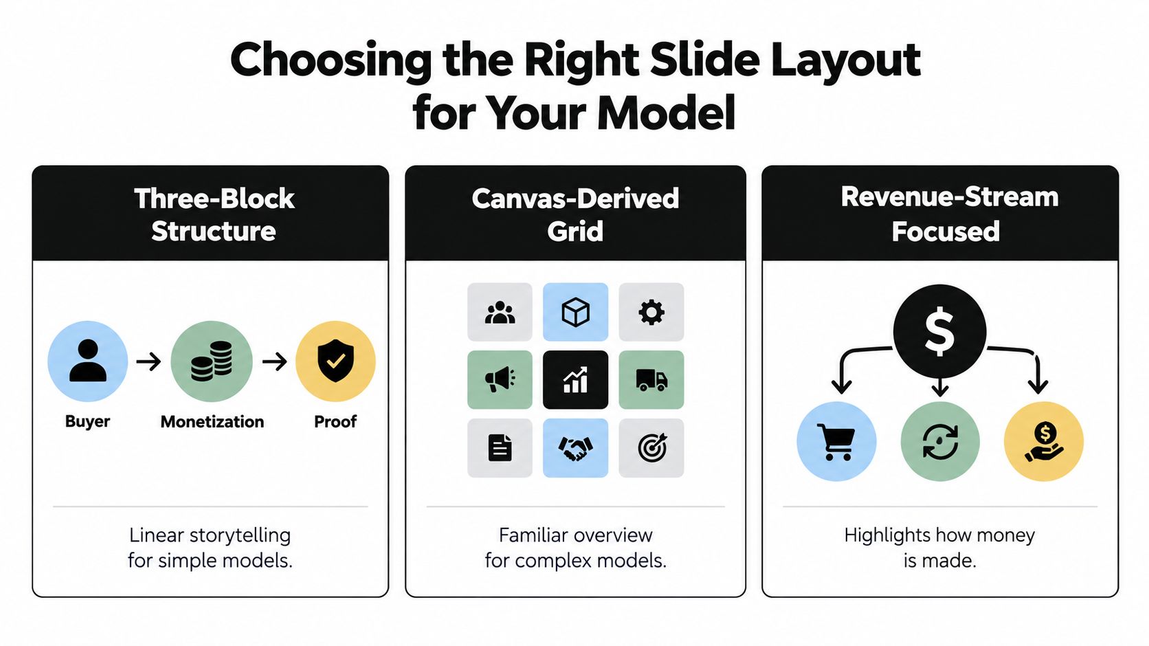
A canvas-derived grid is more appropriate when several dependencies matter at once. Use it for a complex B2B operation, a regulated product, or a model whose partners, delivery activities, and cost structure materially affect scalability. Keep the grid selective. Nine equal boxes can make every fact look equally important, even when one payer or cost dependency controls the entire business.
Match the layout to the economic loop
A revenue-stream table suits a company with distinct monetization paths. It lets the reader compare who pays, what triggers payment, and what evidence supports each stream. It also makes it harder to hide an untested future stream among current revenue.
Marketplaces, ad-supported products, and subsidized-user models need more than a simple “who pays” box. Use an economic-loop diagram:
User or supplier acquisition → usage or transaction event → payer → revenue recognition → variable cost → cash-conversion timing
This format shows where the take rate or margin is generated and which side absorbs acquisition costs. A marketplace can look attractive if the slide shows transaction revenue but omits supplier incentives, buyer acquisition, trust and safety work, or settlement timing. An API business may need to show usage growth alongside infrastructure cost. An ad-supported product should distinguish the user from the advertiser and show what creates an impression or qualified action.
Layout test: Remove the labels and ask whether a stranger can still trace the money flow. If not, the diagram is decorative rather than explanatory.
For further pattern recognition, review pitch deck examples that actually get funded, but don't copy a layout just because it looks polished. A clean three-column slide can mislead when the model has cross-subsidies or regulatory dependencies. In those cases, “simple” means preserving the few relationships that matter, not deleting them.
Use a focused revenue-stream layout for a straightforward subscription or licensing model. Choose an economic loop for a marketplace or platform. Choose the Canvas-derived grid only when operational structure is itself part of the investment case.
Showing What You Know and What You Are Still Testing
A polished pricing diagram can create false confidence. Investors know that early pricing, acquisition economics, and retention often remain uncertain, especially when the company has limited customer volume. The credible response isn't to hide the uncertainty or fill the slide with invented precision. It's to show what is known, what is assumed, and what happens next.
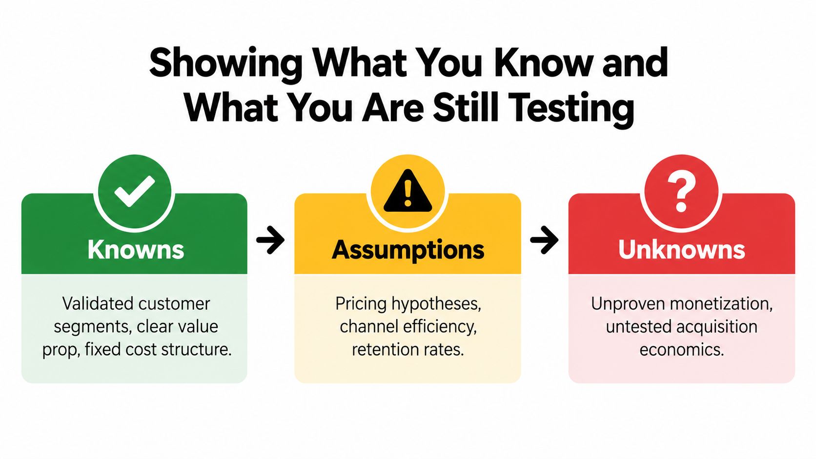
A practical slide can use a compact sequence:
- Now: State the current model and the evidence supporting it.
- Next experiment: Identify the single assumption you need to test next.
- Decision trigger: Define the result that would cause you to keep, change, or abandon the assumption.
For example, a team might write: “Now, founders use free research to identify recurring pain points. Next, test a paid report with a defined buyer segment. Decision trigger, continue if buyers complete payment and delivery cost remains compatible with the target margin.” The exact threshold belongs in the team's operating plan unless it has reliable evidence, but the logic should appear on the slide.
Replace missing metrics with measurement discipline
When CAC, LTV, or payback isn't statistically reliable, don't display a speculative ratio as though it were an observed fact. Show the acquisition channel being tested, the customer action that signals value, the cost you can currently measure, and the retention event you intend to track.
The same principle applies to financial forecasts. SaaS forecasting best practices from Jumpstart Partners can help teams separate assumptions from forecast mechanics, but your slide should still identify which inputs are observed and which are modeled. Investors don't need a perfect early metric. They do need to see that you understand what could invalidate the model.
Credibility comes from stating the condition that would change your mind.
Customer discovery should feed this process. Conversations documented through customer discovery interviews can strengthen the problem and buyer hypotheses, but interview enthusiasm isn't the same as payment behavior. Treat it as evidence with a specific strength, then design the next test accordingly.
An investor can work with an unproven model if the founder understands its uncertainty. What damages confidence is presenting assumptions as facts, especially when a small amount of early activity can't support precise conclusions.
Common Business Model Slide Mistakes and Quick Fixes
Most weak slides fail through omission or confusion, not through a lack of design skill. Founders mention a large market, list prices, and add projected revenue, but never show how a customer becomes a profitable account. The fastest edit is to ask what decision each element helps an investor make.
Five problems worth removing
- Vague market claims: A broad market label doesn't explain your reachable customer base. Replace it with a bottom-up path from target accounts, expected conversion, price, and delivery capacity. If the inputs are estimates, label them.
- Unsupported pricing: A price printed in large type is still a hypothesis unless customers have accepted it or a structured test supports it. Show the source of confidence, such as paid pilots, purchases, renewal behavior, or a clearly designed experiment.
- Revenue confused with usage: Users, API calls, bookings, and impressions aren't revenue. Name the event that creates payment and show the variable cost associated with serving it.
- Too many streams: Listing every possible future product makes the company look unfocused. Prioritize the streams that matter now, then place expansion options in a clearly labeled future path.
- Over-precise projections: Detailed forecasts can imply a level of certainty the evidence doesn't support. Use ranges or rounded assumptions when the underlying inputs remain experimental, and explain the drivers rather than displaying ornamental decimals.
The Australian Investment Council's investor-pitch guidance emphasizes readable typography, limited points per slide, realistic data, and avoidance of unsupported claims. Those are not cosmetic preferences. They reduce the number of inferences a reader has to make.
Treat benchmark percentages carefully
Pitch-deck statistics can provide directional context, but they aren't universal laws. One industry analysis reports that 11–20-slide decks were 43% more successful in fundraising, while another reports that 31% of viewers leave within the first 10 seconds and that 82% of viewers who reach slide 4 complete the deck. The same source cautions that the methodology and causal relationship aren't independently established, and commercial presentation vendors may rely on proprietary samples rather than representative global fundraising data.
Use those figures to justify disciplined sequencing, not to claim that a particular slide count guarantees funding. Your investor, sector, stage, and introduction quality still shape how the deck gets read.
A final design pass should make the payer, mechanism, and proof visually dominant. Reduce jargon, increase contrast, remove decorative elements, and check the slide at normal presentation scale. If the reader needs your voiceover to understand the first line, the slide is carrying too much complexity.
Your Final Checklist Before the Deck Goes Out
Run the slide through a strict review before sending the deck. Start with sequence. The business model slide should follow enough context for the investor to understand the problem, solution, market, and early evidence, but it shouldn't be buried behind a long financial appendix.
Then check the message at reading speed:
- Buyer: Can a reader identify the paying customer without guessing?
- Mechanism: Does the slide state how payment is triggered?
- Streams: Are current revenue streams separated from future hypotheses?
- Economics: Does each important stream connect to cost, margin, retention, acquisition, or payback?
- Proof: Is every factual number supported by observed evidence or a clearly identified source?
- Uncertainty: Are assumptions labeled, with a next experiment and decision trigger?
- Complexity: Does the layout match the model, especially if users, suppliers, advertisers, partners, or regulators play different roles?
- Readability: Can the central economic story be understood without a spoken explanation?
Make the final edit ruthless
Read only the headline, the largest figures, and the labels. That is close to how a rushed investor first encounters the slide. If those elements don't communicate the buyer, payment mechanism, and reason the model can scale, rewriting the body copy won't solve the problem.
Check every number for definition and origin. “Margin” needs a clear basis. “Customers” needs a consistent customer definition. “Revenue” shouldn't include bookings, free users, or pipeline. A slide becomes more trustworthy when it uses fewer numbers with stronger definitions.
Don't force a static model to look proven. A transparent “now, next experiment, decision trigger” path can be more persuasive than a neat but unsupported pricing ladder. Use Find Startup Idea's startup research library to sharpen customer and problem hypotheses, then connect those hypotheses to explicit monetization tests.
The best final question is simple: what would have to be true for this business to work, and can the slide show how the team will find out? If the answer is visible in one quick read, the business model slide is doing its job.
Find Startup Idea surfaces startup opportunities from real HN and Reddit pain points, helping founders turn recurring problems into sharper customer and business-model hypotheses. Visit Find Startup Idea to research problems worth solving and build a more evidence-led pitch.