Startup Pitch Guide: Build a Deck Investors Actually Read
Craft a startup pitch that earns investor attention in under three minutes. Proven structure, slide-by-slide advice, and founder-tested tips that convert.
You're probably staring at a deck that feels polished enough, but you still know it isn't landing. The problem isn't that you need prettier slides. The problem is that an investor has almost no time, almost no patience, and a long list of reasons to pass before you've even finished your first breath.
A real startup pitch is not a performance piece. It's a filter test. Your only job is to make the right investor keep reading long enough to ask for a second meeting, because that's the moment the conversation starts to matter.
What an Investor Is Actually Doing During Your Pitch
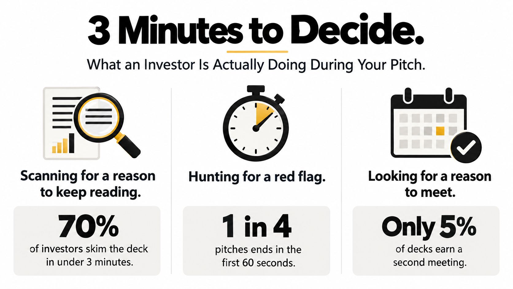
An investor is not sitting there waiting to be impressed. They're scanning for one thing, a reason to keep going. If they don't find it fast, they move on, and your deck becomes one more file they half-remember later.
The time pressure is brutal. A study of 320 pitch decks found investors spent 24% less time on decks in 2022 than in 2021, and unfunded decks were abandoned after 2 minutes and 13 seconds on average, according to TechCrunch's review of pitch deck behavior. That's not a full read. That's a triage pass.
What happens in the first pass
In the first few seconds, they're asking four silent questions. Is this a real problem, is the market worth caring about, is there evidence anybody wants this, and does the founder sound like someone who can execute. If one of those answers is fuzzy, the rest of the deck has to work harder.
Practical rule: your deck should earn a second look before it tries to earn belief.
That's why founders lose deals with good design and weak substance. The investor isn't grading beauty. They're deciding whether this deserves more of their very limited attention.
The right mental model is simple. Your deck is a screening document, not a business plan in disguise. It needs to surface the opportunity quickly, show enough proof to reduce doubt, and make the follow-up obvious. If you're building it as if someone will read every word, you're already off target.
Locking the Story Before You Touch a Slide
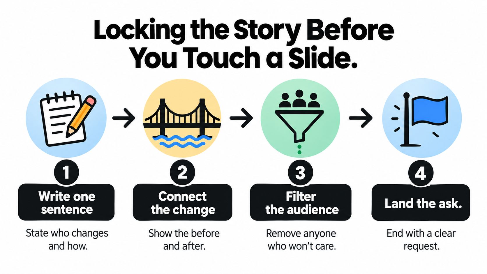
Start with one sentence. Not a paragraph, not a vision statement, not a manifesto. One sentence that says who changes, what changes, and why this company should exist now.
If you can't say that sentence out loud without stumbling, don't open Keynote yet. A founder who can't explain the story cleanly will usually hide the weakness in slide count, design flourishes, or market-size theater.
Build the narrative spine first
Your sentence needs a clear spine, problem, insight, solution, proof. The problem has to be specific enough that a customer would nod immediately. The insight has to sound earned, not borrowed. The solution has to feel like the obvious answer to that pain, not a random product attached to a big trend.
Use the same discipline you'd use if you were making a short trailer. The point isn't to explain everything. It's to make the viewer understand the change, feel the tension, and want the next scene. If you want a strong example of how concise narrative works in a different medium, this guide on how to make a promotional trailer is useful because it shows how to compress story into a clear arc without wasting motion.
Test the story before you design
Say the sentence to five people who don't know the company. Ask them what problem they think you solve, who the customer is, and what makes your approach different. If they describe a different business, your pitch is broken before it starts.
Then map the deck to that sentence, slide by slide. If a slide doesn't move the story forward, cut it. If two slides say the same thing, merge them. And if your story depends on a leap of faith, use your customer discovery notes to tighten the claim before you present it, especially if you've already done the work in customer discovery interviews.
A lot of founders open with a founder story because it feels personal. That can work, but only if the founder story explains why this problem matters now. Otherwise, start with the market change or the customer pain. The audience cares about momentum, not autobiography.
The Slide-by-Slide Deck That Earns the Second Meeting
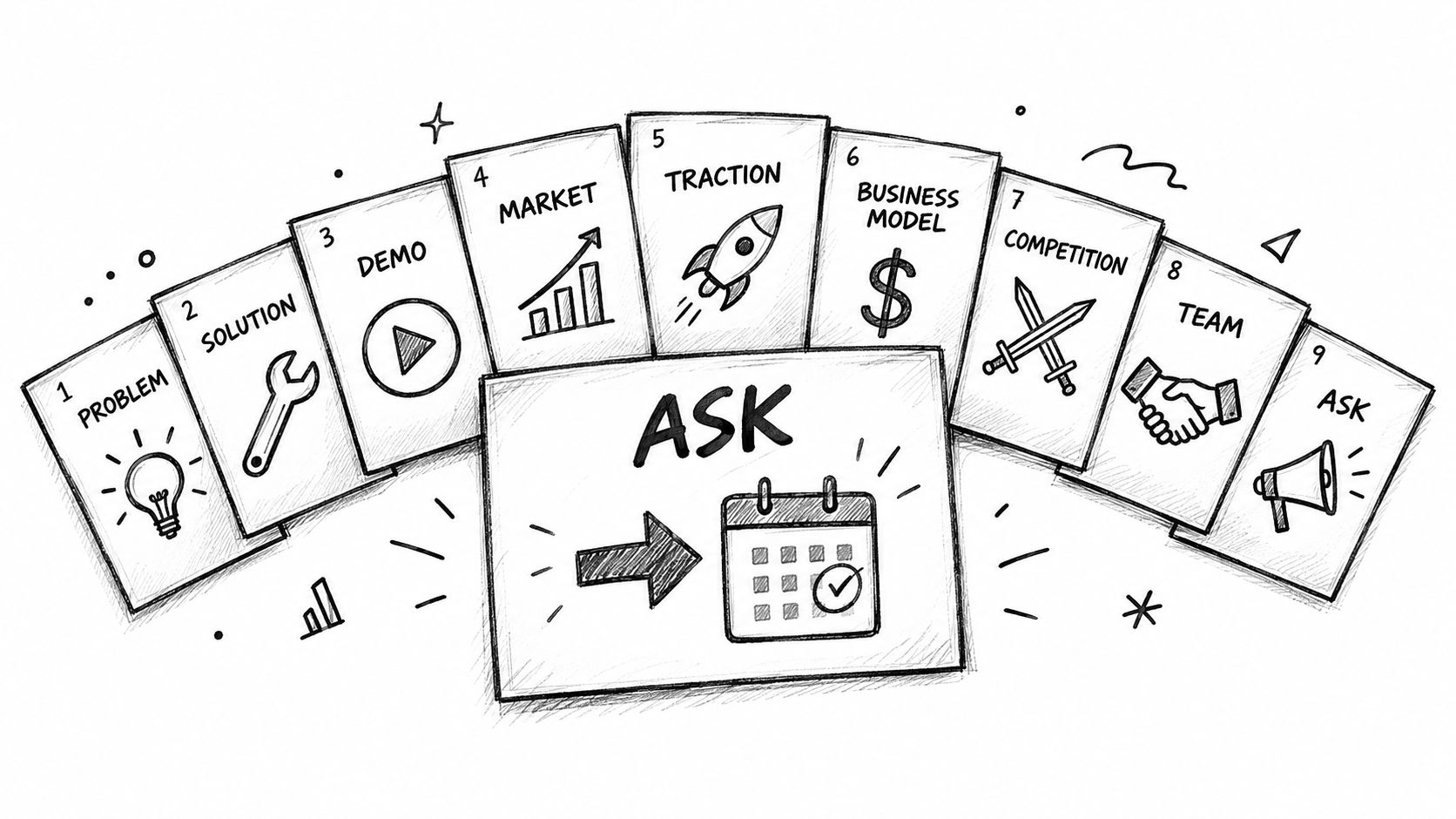
The best decks are simple because they know what each slide is for. One slide should do one job. If a slide tries to convince, explain, forecast, and impress all at once, it usually does none of those well.
The core sequence
Here's the spine I'd use for most early-stage decks:
- Title. Name, one-line description, and a clean visual cue. No slogans, no clutter.
- Problem. State the pain in concrete terms. Make it feel urgent.
- Solution. Show what you built and why it fits the problem.
- Demo or product. Use screenshots, a short flow, or a live product view.
- Market. Show that the opportunity is real and large enough to matter.
- Traction. Present the proof that someone cares.
- Business model. Explain how money comes in, plainly.
- Competition. Show what you win on and where the alternatives fall short.
- Team. Show why this team is the right one for this market.
- Ask. State what you're raising, what it funds, and what milestones it buys.
That structure lines up with the way investors scan for fit, risk, and momentum. It also forces you to keep the story honest. If you don't have traction yet, the rest of the deck has to compensate with sharper evidence and a more believable path.
What each slide must actually earn
| Slide | Design Lever | Substance Lever | Common Mistake |
|---|---|---|---|
| Title | One clean visual cue | One-line company definition | A branded wallpaper slide |
| Problem | Big, legible headline | A painful customer reality | Generic market angst |
| Solution | Simple product framing | Clear before-and-after change | Feature dump |
| Demo | Visual clarity | Product in action | Screenshots with no context |
| Market | Clean hierarchy | Bottom-up logic | Inflated top-down TAM |
| Traction | Minimal clutter | Evidence of demand | Vanity metrics without meaning |
| Business Model | Easy-to-read flow | Real revenue logic | Pricing buried in text |
| Competition | Simple matrix | Honest differentiation | Claiming you have no competitors |
| Team | Readable bios | Relevant execution proof | Resume dump |
| Ask | Clear layout | Funding, use, milestones | Vague capital request |
The ask slide deserves more respect than most founders give it. Investors want to know the round size, what the capital does, and what has to be true next. If that slide is fuzzy, the whole deck feels evasive.
Later, when you're tightening the business model slide, use the same discipline as the business model slide guide, because the job is to show how the company earns, not to dress up a spreadsheet.
Slide count discipline matters
You don't get extra credit for complexity. If you can make the case in eight slides, do it. If you need the full ten, keep them tight. More slides don't buy you more attention, they usually buy you more chances to lose it.
Keep the appendix for the stuff that supports diligence, not the stuff that should have been in the main story.
A clean deck gives the investor a path. It doesn't force them to assemble the company from fragments.
Designing Slides That Get Read, Not Just Liked
Design matters, but only as a delivery system for proof. In a randomized set of three experiments involving nearly 35,000 investors, visual fluency raised time spent by about 35% and slides viewed by 12%, but only substantive quality increased stated investment likelihood, according to research on content versus design in startup pitch decks. That's the rule. Design buys attention. Evidence earns action.
Use design to reduce friction
A good slide should answer the eye before it answers the brain. That means large type, one idea per slide, strong contrast, and a layout that makes the takeaway obvious in seconds. It also means cutting the junk that makes investors work too hard, because nobody rewards effort when the deck itself feels effortful.
The best visuals are boring in the right way. Cohort tables, simple bars, clean funnels, and a chart with the headline written directly on it do more than fancy diagrams ever will. They give the investor a fast read on retention, growth shape, or market logic without making them decode your aesthetics.
Spend your visual budget on proof
Don't waste space on decorative logos, crowded icons, or three-column comparison slides that say less than one strong chart. If a slide is full of logos but empty of inference, it's vanity. If a slide is dense with numbers but leaves the conclusion hidden, it's also a failure.
| Slide Type | What It Earns You | Best Use |
|---|---|---|
| Cohort chart | Confidence in retention | Showing repeat behavior over time |
| Simple bar chart | Fast comparison | Revenue mix, usage mix, or segment split |
| Funnel chart | Conversion logic | Lead flow or acquisition clarity |
| Market diagram | Strategic context | Explaining category structure |
| Logo wall | Social proof at a glance | Only when customers matter more than scale |
| Dense table | Diligence detail | Appendix, not opening story |
Version every metric. Date it, label the denominator, and make the time period visible. A stale metric looks like a founder who stopped paying attention, and that's exactly how an investor starts questioning operational realism.
The strongest decks feel calm. They don't shout. They let the evidence do the work, and they keep the design clean enough that the evidence is impossible to miss.
Qualifying the Investor Before You Send the Deck
Most founders think rejection means the pitch was weak. Often, the problem is audience mismatch. A fund can like your business and still pass because the stage, check size, geography, sector, or timing is wrong.
That is why you qualify investors before you send anything. The deck should not be used as a fishing lure for everyone. It should be sent to people who can say yes.
Read the fund like a buyer
Look at the portfolio first. Are they already crowded in your category, or do they have room to add another company like yours. Are they known for your stage, or do they usually show up much later. Do they deploy actively, or are they sitting on capital and acting busy.
If you want a practical way to map investors faster, the EmailScout tips for finding investors page is useful because it reinforces the idea that targeting is a research task, not a spray-and-pray exercise. You're not searching for “a VC.” You're searching for the specific fund whose thesis can absorb your company without friction.
Treat rejection as signal
Techstars recommends asking investors what would make the company a fit later and what was unclear or missing, which turns rejection into feedback instead of theater, according to SheetVenture's summary of common investor pass reasons. That question matters because it separates fixable evidence gaps from non-fixable mandate conflicts.
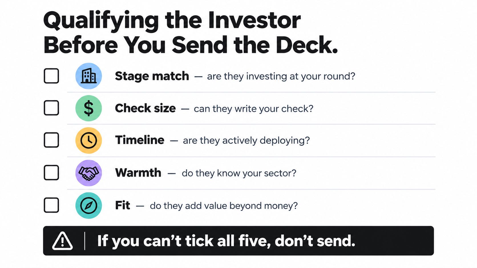
Use this five-part filter before you send the deck:
- Stage match: are they investing at your round?
- Check size: can they write your check?
- Timeline: are they actively deploying?
- Warmth: do they know your sector?
- Fit: do they add value beyond money?
If you can't confidently answer yes on most of those, don't waste the outreach. A better deck won't rescue a misaligned target list. The smarter move is to change the audience, not just the slides.
Delivering the Pitch Without Fooling Yourself
Delivery matters. Research analyzing more than 1,100 accelerator pitch videos found visibly happier teams were 17% more likely to receive funding and more enthusiastic teams were 27% more likely, but those firms later underperformed on raising a second round, according to Yale SOM's analysis of passionate startup pitches. So yes, energy helps. No, energy isn't the business.
Rehearse the right kind of confidence
You need to sound warm, clear, and hard to rattle. That doesn't mean performing hype. It means speaking like someone who knows the market, understands the customer, and isn't afraid of a sharp question.
The first 60 seconds matter most. Open with the problem and the change you're trying to create. Don't wander into your origin story unless it makes the problem sharper. Don't spend your opening proving you're smart. Spend it proving the company is worth listening to.
Separate presence from proof
Run a calibration review before every real meeting. Have one person score delivery, another score market evidence, another score traction and execution risk. Keep those scores separate, because confident delivery can mask weak fundamentals.
A founder who sounds polished but can't defend the numbers is still weak, just louder.
When questions get hostile, answer directly and stop talking. A founder who fills silence with more slides, more qualifiers, or a defensive monologue usually gives away the room. If you don't know an answer, say what you know, say what you're checking, and move on.
Before you pitch, revisit the MVP thinking guide if you need a reality check on what has been validated versus what still belongs in the hypothesis bucket. That distinction keeps you from overselling unfinished proof.
The goal isn't to look fearless. The goal is to look like someone who's honest, prepared, and already thinking like the operator who'll own the next stage of the business.
The Pre-Pitch Checklist You Run Every Morning
TechCrunch's investor interviews say the fastest way to lose trust is to show up with wildly optimistic projections, misrepresented numbers, or an unclear use of funds, according to their reporting on why VCs ghost founders or reject deals. That's the short version. Investors don't need perfection. They need honesty they can verify.
Run the same checklist every time
Before a pitch, make sure these are true:
- Your story is one sentence. If you need a second sentence to explain the first, it's not locked.
- Every metric has a denominator. Nobody should have to guess what the number means.
- Every metric has a time period. Old numbers without a date look stale even when they're real.
- Your projections expose assumptions. If pricing, conversion, or retention changes the outcome, say so.
- Your investor is qualified. Stage, check size, thesis, and timing all make sense.
- Your deck is cleanly versioned. No outdated slides, no accidental stale claims, no confusion about which file is current.
- Your ask is specific. Round size, use of funds, and milestones are obvious.
- Your delivery is calm and human. Energy helps, but clarity closes.
The strongest pitch is the simplest honest version of a fundable company. It doesn't inflate the market, hide the weak spots, or confuse enthusiasm with traction. It states the opportunity clearly, proves the parts that matter, and asks for money like a founder who knows exactly what that capital buys.
If you want sharper startup ideas before you ever build a deck, Find Startup Idea helps you spot real pain points worth turning into companies. Use it to pressure-test the problem, the buyer, and the market before you spend weeks polishing slides for the wrong story.