7 Waitlist Landing Page Examples Worth Copying
Real waitlist landing page examples broken down by copy, design, and hooks — plus replicable tactics, benchmarks, and A/B ideas for your own launch.
A single-field form isn't a waitlist strategy. It's often a way to avoid committing to a pitch. Removing fields won't fix an unclear promise, and adding a referral leaderboard won't tell you whether anyone needs the product.
The useful question isn't how many emails you can collect. It's what commitment you need before making your next investment. That might be a reply from a qualified buyer, a request for a particular feature, participation in a beta, or payment for a reservation.
These seven waitlist landing page examples solve different launch problems: setting expectations, segmenting demand, encouraging referrals, and controlling access. Some are live signup destinations; others are historical campaigns worth studying for their mechanics, not copying pixel for pixel.
Copy the reason behind the page, not just the form above the fold.
Each pattern below includes the copy and design decisions worth borrowing, the trade-offs they introduce, and an A/B test tied to a meaningful outcome. You don't need every mechanic. You need the one that answers your next business question.
1. Dropbox Dash
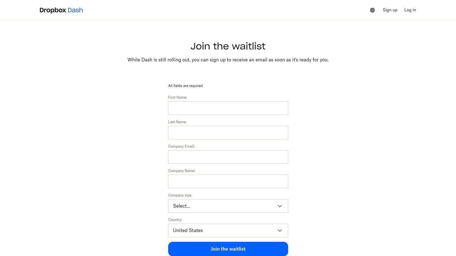
Dominant tactic: transparency. The Dropbox Dash for Teams waitlist connects the signup to an identifiable product, explains that visitors will receive an email when Dash is ready, and makes clear that registration doesn't guarantee access.
That last detail matters. A button inviting someone to join can imply immediate availability unless the surrounding copy says otherwise. Dropbox separates expressing interest from receiving access, so visitors can make an informed decision.
The design lesson is restraint with context. Keep the form simple, but don't strip away the explanation of what people are joining or what happens afterward. An unfamiliar startup needs a sharper product explanation than an established brand with an existing audience.
Steal the expectation-setting copy
Place a short explanation beside the form covering the product, the next communication, and any eligibility limits. Don't hide access restrictions in a footer that visitors only discover after submitting.
- Best fit: A launch with uncertain availability or a rollout that depends on eligibility.
- Trade-off: Honest restrictions may discourage casual signups, but those registrations weren't necessarily useful demand.
- A/B test: Compare a generic signup prompt against a benefit-led prompt with explicit email and access expectations. Measure verified registrations and subsequent invitation acceptance, not button clicks alone.
Treat those expectations as part of your go-to-market approach, not administrative small print. If your acquisition message promises instant access while your confirmation says otherwise, changing the button color won't solve the mismatch.
2. PostHog Roadmap
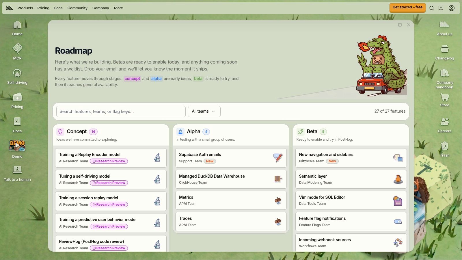
A general waitlist answers whether someone likes your overall direction. The PostHog roadmap offers a more specific model: let visitors explore upcoming features, understand their development stages, and express interest in the capabilities relevant to them.
Dominant tactic: segmented demand. Organizing features into stages such as concept, alpha, and beta gives the signup useful context. Someone interested in an exploratory idea shouldn't leave with the same availability expectations as someone requesting a feature already approaching release.
For founders choosing between adjacent ideas, this approach can be more informative than a broad coming-soon page. You can attach interest to a feature and a use case rather than interpreting every email as approval of the entire roadmap.
Steal feature-level intent
Use concise feature cards with a problem statement, current stage, and relevant interest action. Explain the stages in plain language so visitors don't have to guess what access might involve.
The trade-off is focus. A broad roadmap works when visitors already understand the product. For cold traffic, sending everyone into a catalog can make the main offer harder to identify. Keep campaign destinations focused on the feature advertised.
A/B test a general product waitlist against a feature-specific signup destination while keeping the audience and acquisition message consistent. Compare qualified registrations and replies describing the selected problem.
Qualification doesn't have to happen before signup. The Moonbeam launch case study reported that 88% of registrants completed a 10-question survey during signup. That's a useful example of pairing acquisition with discovery, not a reason to require a lengthy questionnaire from every visitor.
3. Datadog Product Preview Program
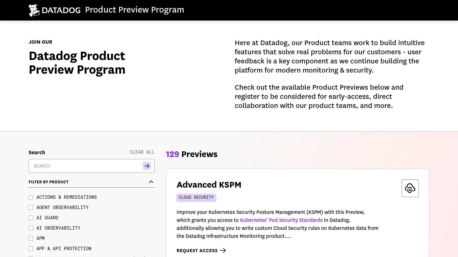
Choose this pattern when early access is an ongoing operation, not a launch event. The Datadog Product Preview Program brings multiple previews into a shared destination where customers can identify relevant features and request access.
Unlike a roadmap, which helps visitors understand what's being developed, a preview program emphasizes participation. The practical hook is access to something relevant to the customer's work, with an opportunity to provide feedback during development.
Dominant tactic: program-based segmentation. The useful design unit is the preview listing: what it does, who it suits, and how to request participation. That structure gives teams a repeatable process instead of a growing collection of unrelated beta forms.
- Steal this: Store the requested preview alongside the contact record, then use that preference to determine invitations and follow-up.
- Best fit: B2B products releasing several capabilities to different customer groups.
- Watch out: A program directory is unnecessary overhead when you're still testing a single proposition.
Test relevance before adding complexity
Compare a shared preview directory against a focused page for the visitor's advertised use case. Measure eligible requests and participation after invitation, not just how many people browse the directory.
The operational cost sits behind the page. Someone must own eligibility checks, access decisions, feedback collection, and status updates. If nobody can act on the segmentation, collecting it adds friction without improving decisions.
Build the follow-up into your startup email marketing: acknowledge the requested preview, explain the next step, and send updates relevant to that request. Don't turn a feature-specific signup into permission for unrelated promotional messages.
4. Robinhood Banking
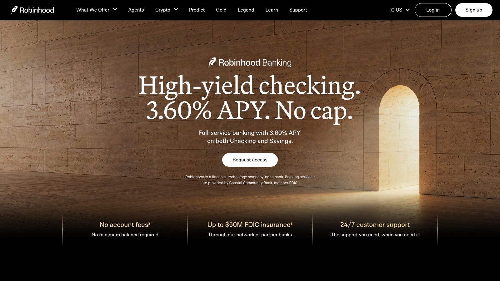
People don't want a place on a list. They want whatever becoming a customer will let them do. The Robinhood Banking page illustrates an offer-first approach, presenting the banking proposition alongside an invitation-based access model.
Dominant tactic: a concrete offer. The product proposition gives visitors a reason to request access; the access language explains the constraint. Those are separate jobs, and your page needs both.
For a startup, the replicable copy structure is an outcome-led headline, a concise explanation of the product, and an action that accurately describes the next step. Don't imitate financial-product positioning or eligibility language that doesn't apply to your offer.
Practical rule: Lead with why someone should care. Explain why they might have to wait beside the action, not instead of the benefit.
Steal benefit-led action copy
Compare a generic waitlist CTA with an outcome-specific access request. Keep the underlying offer and eligibility explanation unchanged so you're testing the wording rather than different promises.
A related CTA experiment offers useful context: the Going case study from Unbounce reports a 104% month-over-month increase in trial starts for a variant emphasizing a free trial. It wasn't a waitlist experiment, so treat it as a reason to test benefit-specific language, not an expected lift.
The trade-off is that a compelling offer can attract people who don't qualify. Make subscription requirements, invitation rules, and other material conditions visible before submission. Evaluate eligible requests and eventual acceptance alongside signup volume.
5. Harry's Prelaunch Campaign
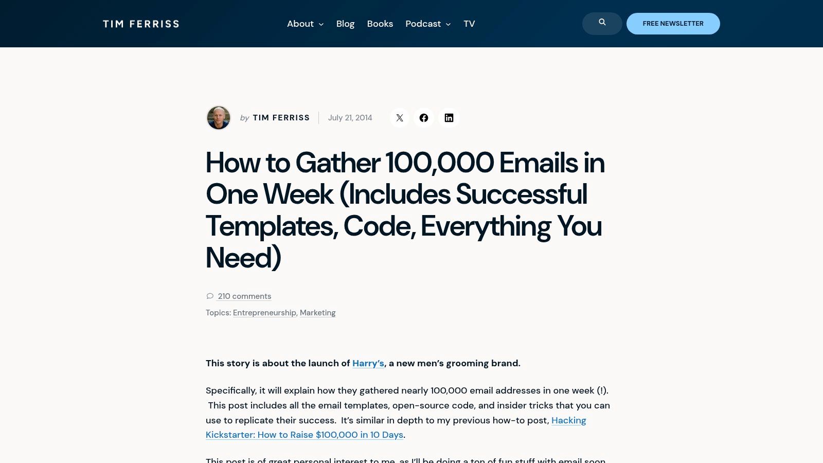
Dominant tactic: product-relevant referral rewards. The historical Harry's prelaunch campaign account describes an email signup followed by a referral reward ladder. Subscribers could invite friends and earn rewards connected to the product being launched.
The distinction is relevance. A reward related to the eventual purchase gives people a reason to share with potential customers. A generic prize can motivate sharing without establishing demand for your product.
The useful design move happens after conversion. First explain the product and collect the registration. Then show the referral mechanism, the available rewards, and how progress is counted.
Steal the post-signup sequence
Don't place a complicated reward system ahead of the product pitch. On the confirmation page, make the sharing action easy to understand and state any qualification conditions before participants start inviting people.
- A/B test: Compare a confirmation page offering product-relevant referral rewards against a confirmation page without an incentive.
- Primary measure: Compare qualified referred subscribers and their subsequent activation, not shares or raw registrations.
- Trade-off: You'll need attribution, duplicate handling, reward fulfillment, and a clear policy for invalid referrals.
The Taqwah waitlist guide provides context for a quality-adjusted waitlist approach: assess verification, target-segment fit, willingness to pay, and activation rather than assuming viral volume proves demand.
Use referrals to extend a credible offer, not rescue an unconvincing one. Your market validation process should still establish whether referred subscribers have the problem and intend to use the solution.
6. Linear
A beta can fail operationally even when acquisition succeeds. If you invite more people than you can onboard or support, you may collect feedback about an unfinished experience rather than the product decision you intended to test.
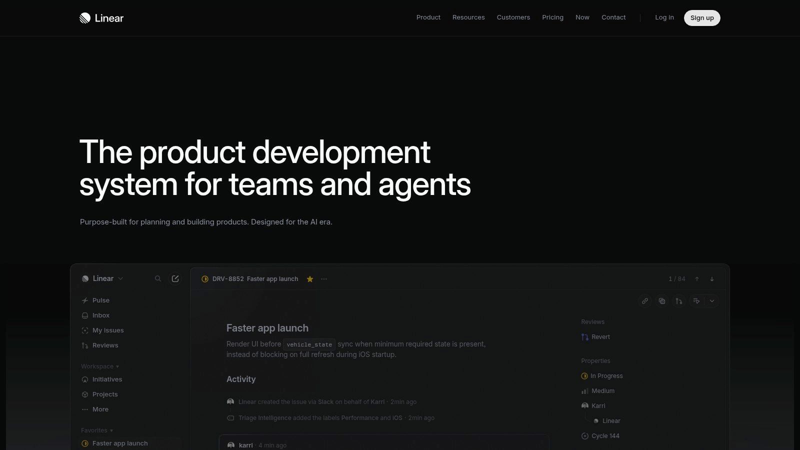
Dominant tactic: controlled cohorts. Linear is useful here as a historical early-access strategy, not a currently active waitlist to reproduce. Its early waitlist illustrates pacing access around useful early adopters and feedback rather than relying on a viral referral loop.
For this pattern, the copy should identify who the beta serves and what participation involves. The form should request only information that changes selection or onboarding. A qualification question is justified when someone uses the answer.
Limited access should reflect your capacity to deliver a useful beta, not a scarcity claim invented to make the page feel exclusive.
Steal intentional selection
Start with a focused audience and an explicit invitation process. Explain whether applicants are selected by use case, compatibility, or onboarding capacity, and provide an update if availability changes.
Test an email-only form against a form with a relevant use-case question. Judge the variants by invited users who activate and contribute usable feedback. A higher submission rate isn't automatically better if the team can't identify suitable participants.
Keep form usability separate from qualification strategy. In a different landing-page context, Contentsquare's Bannersnack example reports 25% more sign-ups after testing a larger, higher-contrast CTA. Before blaming your qualifying question, check whether visitors can find and comfortably use the form, especially on mobile.
7. Waymo
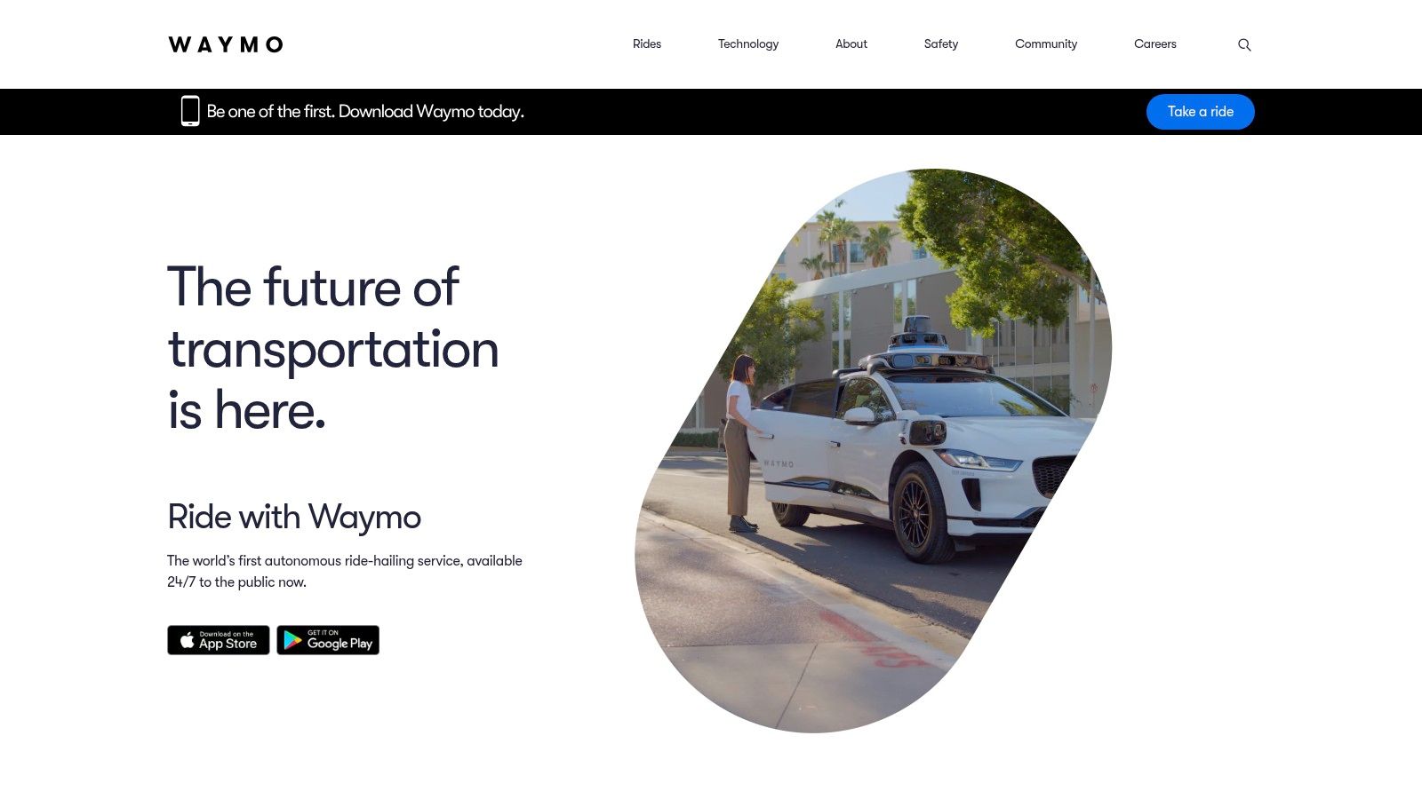
Where someone lives can determine whether they can become a customer. The Waymo One service page illustrates a location-dependent rollout, distinguishing service availability from areas where expansion and updates are relevant.
Dominant tactic: constraint-based access. Geography isn't decorative personalization in this model. It determines the action a visitor should take and the expectations attached to that action.
The same pattern suits local marketplaces, delivery services, and businesses that need operational coverage before accepting customers. Don't show everyone an identical access promise when you already know that promise depends on location.
Steal availability-aware signup
Make the service-area distinction easy to scan, then ask for the least precise location information needed to route the visitor. If city-level information is enough, don't request a full street address.
- Available areas: Direct visitors toward the action they can take now.
- Future areas: Offer relevant expansion updates without implying a guaranteed launch date.
- A/B test: Compare asking for location before email capture against collecting it immediately afterward. Measure usable, location-qualified registrations and completion across the whole flow.
The trade-off is maintenance. Someone must update coverage information and keep signup confirmations consistent with actual availability. Otherwise, the same segmentation that should clarify access creates confusion.
The LaunchList examples guide offers useful context for post-signup mechanics, but your operational explanation needs to go further: state what subscribers receive, whether queue position matters, and how they can unsubscribe. Only display a queue if you use it to determine access.
Waitlist Examples Compared
| Example | Core Tactic | Best For | Live or Historical |
|---|---|---|---|
| Dropbox Dash | Transparent, low-friction signup with clear access expectations | Products with a staged rollout | Live |
| PostHog Roadmap | Feature roadmap with stage-based interest collection | Validating demand across multiple features | Live |
| Datadog Product Preview Program | Ongoing, feature-specific preview requests and feedback | B2B companies releasing features in waves | Live |
| Robinhood Banking | Concrete product offer with invitation-based access | Controlled rollouts with clear eligibility requirements | Live |
| Harry's Prelaunch Campaign | Referral rewards tied to signup milestones | Product launches seeking incentivized sharing | Historical |
| Linear | Curated beta access to support feedback and rollout control | Products that benefit from focused early-adopter cohorts | Historical |
| Waymo | Location-based access and updates tied to service coverage | Services with geographically limited availability | Live |
From Signups to Proof Turn These Patterns Into Your Own Test
The strongest pattern depends on the uncertainty you're trying to resolve. Dropbox demonstrates transparency; PostHog and Datadog segment demand; Robinhood leads with an offer; Harry's encourages referrals; Linear controls cohorts; Waymo ties access to operational constraints.
Combine an offer-driven hook with an access mechanic. A reporting tool might promise less manual reconciliation and invite qualified finance teams into a curated beta. A local service might explain the customer outcome and collect interest by service area.
Build a test you can interpret
Start with a concrete headline, a product explanation, an honest CTA, and a confirmation that tells subscribers what happens next. If the product needs a visual explanation, use the 15-second SaaS teaser guide to plan a concise demonstration. Don't let a polished video substitute for a clear proposition.
Track the full path: visitor, verified signup, qualified prospect, invitation, activation, and payment. Record acquisition source so you don't compare enthusiastic followers with strangers arriving from ads.
- Use cold traffic: Our validation process calls for 200–500 cold visits before drawing conclusions. That's a practical testing window, not a guarantee of statistical significance.
- Set directional targets: Our cold-ad benchmarks are 4%+ email capture and 1%+ paid waitlist or preorder conversion. Treat them as operating targets, not universal industry averages.
- Ask for commitment: For a SaaS or digital product, our approach uses a landing page with Stripe checkout. Payment from strangers is stronger evidence than an email alone.
A paid signup still needs clear terms explaining what the buyer is reserving, when you expect delivery, and how refunds work. Don't charge against a promise you can't explain.
Find Startup Idea offers ideas sourced from real HN and Reddit pain points, giving you specific problems to put behind a waitlist. Choose a problem, make a credible offer, and measure whether strangers commit money, time, or a clear next step.
Find Startup Idea helps you find startup ideas sourced from real HN and Reddit pain points, save the ones you'd put your name on, and generate a launch prompt. Visit Find Startup Idea, choose an idea, and turn its underlying problem into a focused waitlist offer you can test with strangers.